When I'm navigating around the web, I find myself doing some odd things. If I'm looking at a website for the first time, I will put my cursor onto the right side of the browser window. I will drag that side in and watch in anticipation as to see whether the layout adapts to the smaller width. I'm constantly looking at what surprises a site will offer when looking at them from various devices. One of the things that I tend to add is a menu that grabs attention.
I have put together a small demo on my Github, which can be seen at the slide menu git repository. Use the menu to navigate to the other 3 examples.
The Setup
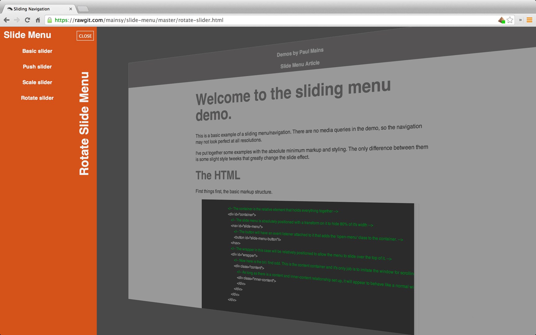
To take advantage of some of techniques mentioned, the markup needs to adhere to a certain structure. We need to take advantage of elements identified as containers and wrappers. This is so we can more easily manipulate the DOM with both javascript and css. Here we can see the spine of the layout.
	<div id="container">
		<nav>
		</nav>
		<div id="wrapper">
			<div class="content">
				<div class="inner-content">
				</div>
			</div>
		</div>
	</div>
The Slide Menu
The most basic approach to menu that expands to reveal it's content, is the slide menu. When accessed (presumably from a menu button) it will slide OVER the page content from an off canvas starting position. It's easier because you only need to apply the transition to the menu. You don't need to apply any transition to the content. This is demonstrated at this basic slide menu example. I would typically only make this menu appear on tablet and mobile device resolutions. My media query to do display this would likely kick in at 768px depending on the layout.
The css that makes this happen is the transform translate3d function with a bit of help from the transition function.
	-webkit-transition: ease-in-out 0.25s;
	transition: ease-in-out 0.25s;
	-webkit-transform: translate3d(-100%, 0, 0);
	transform: translate3d(-100%, 0, 0);
When the menu is triggered we set it back to...
	-webkit-transform: translate3d(0, 0, 0);
	transform: translate3d(0, 0, 0);
The Push Menu
Building on top of the slide menu we can add the effect of pushing the content off the canvas. No changes need to occur to the menu, that will slide in and out as before. The only difference is that the wrapper needs to be transformed. This is displayed here in the push slide menu example. Adding this style to the wrapper when the menu is opened would do the trick (depending on the size of the menu).
	-webkit-transform: translate3d(260px, 0, 0);
	transform: translate3d(260px, 0, 0);
The Push Menu With Scale Effect
Now that the content is being transformed as well as the menu. We can add some interesting effects when the menu is triggered. The scale effect can be seen at this push slide menu with scale effect example. Something else needs to be added to achieve that particular effect. The transform style needs to be utilised to allow the z-axis manipulations to be observed.
	-webkit-transform-style: preserve-3d;
	transform-style: preserve-3d;
Once that is added the transformation be altered to sink into the background, like so.
	-webkit-transform: translate3d(100px, 0, -800px);
	transform: translate3d(100px, 0, -800px);
The Push Menu With Scale & Rotate Effect
My personal preference is to tilt the content also. This is demonstrated at this push slide menu with scale and rotate effect example. To do this all that is needed is to add a rotation to the transform.
	-webkit-transform: translate3d(100px, 0, -200px) rotateY(-35deg);
	transform: translate3d(100px, 0, -200px) rotateY(-35deg);
And that ladies and gentlemen is how you do that.